For The Art of Reading: Forty Illustrators Celebrate the 40th Anniversary of RIF (Reading is Fundamental), each contributor wrote about a book that influenced him or her as a child and created a piece of art to accompany the article. I chose write about 2001: A Space Odyssey – the book and the movie, but mostly about the book. (The full essay is in the Writings section this site)
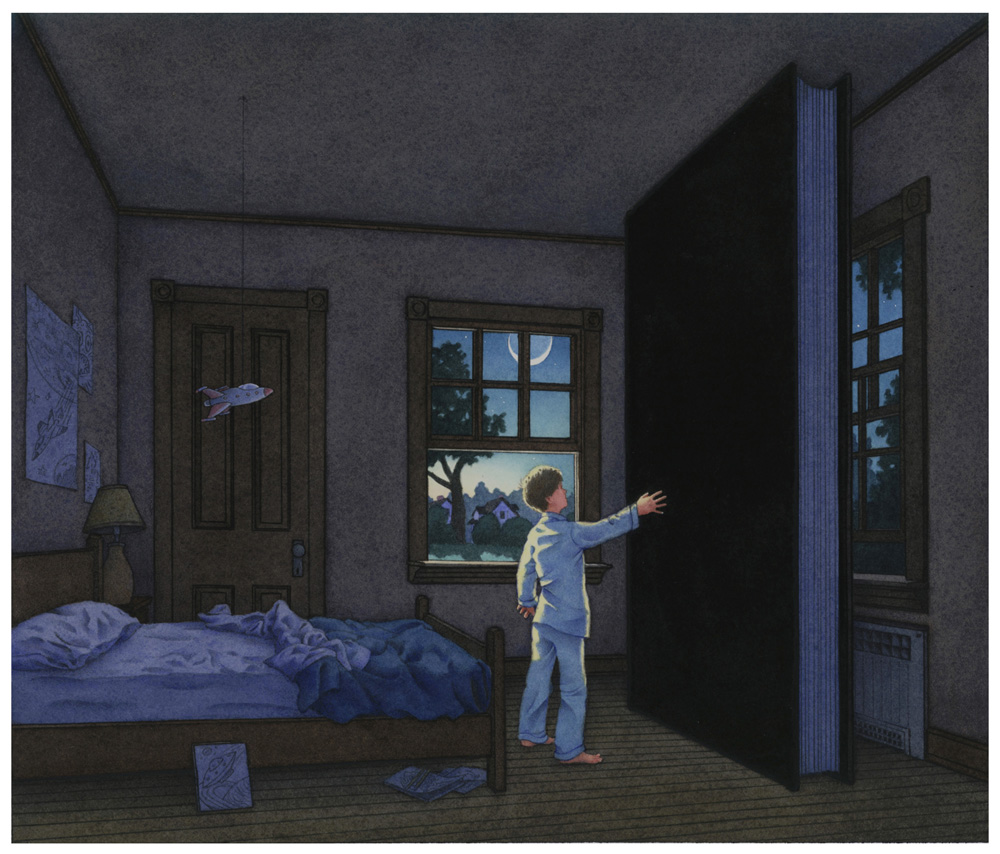
This is the piece of art I created:
In the essay, I had this to say about the movie:
“By the time I was in seventh grade I had seen all the great and not-so-great outer space and alien invasion movies—Forbidden Planet, Invaders From Mars, The Angry Red Planet. But none of those prepared me for the movie 2001: A Space Odyssey. I was amazed, confused, and ultimately inspired by its visual impact.”
That’s putting it mildly. It is not hyperbole to say that seeing this film changed the way I thought about visual narrative. Actually, maybe what it did was create the way I thought about visual narrative.
I was wrong, in the quote above, because the film came out in the fall of 1968, which was the start of my eighth grade, not seventh. Some friends of mine had gone to see 2001 and tried to describe it to me.
Yeah, so there’s these apes and they’re jumping around and screaming and – OH! – there’s this big black stone and then, – Oh! Oh! – one guy hits this other guy one the head with a bone and then the first guy throws this bone in the air and it turns into a space ship – NO REALLY! – and then this computer goes crazy and kills this guy and then this astronaut is in a hotel room and then there’s this baby – Yeah! No kidding, a baby! – on a bed and it ends.
I had no idea what they were talking about. I’m sure they didn’t either. I had to see for myself, so I headed down to the Brook Theater in Bound Brook, NJ.

And, well, I wasn’t really sure what I had seen. But I wanted to see it again. It was such an overwhelming visual experience. The film luxuriates in its imagery – imagery that it as much about movement and composition as it is about story. At fourteen, I had no frame of reference for anything like this.
Books have literally been written about the film, so I won’t go into an analysis of it. But, just to show that I actually had some perspective about this, I offer up exhibit A – a parody movie poster that my friends and I cooked up in the lunchroom one day (I drew it):
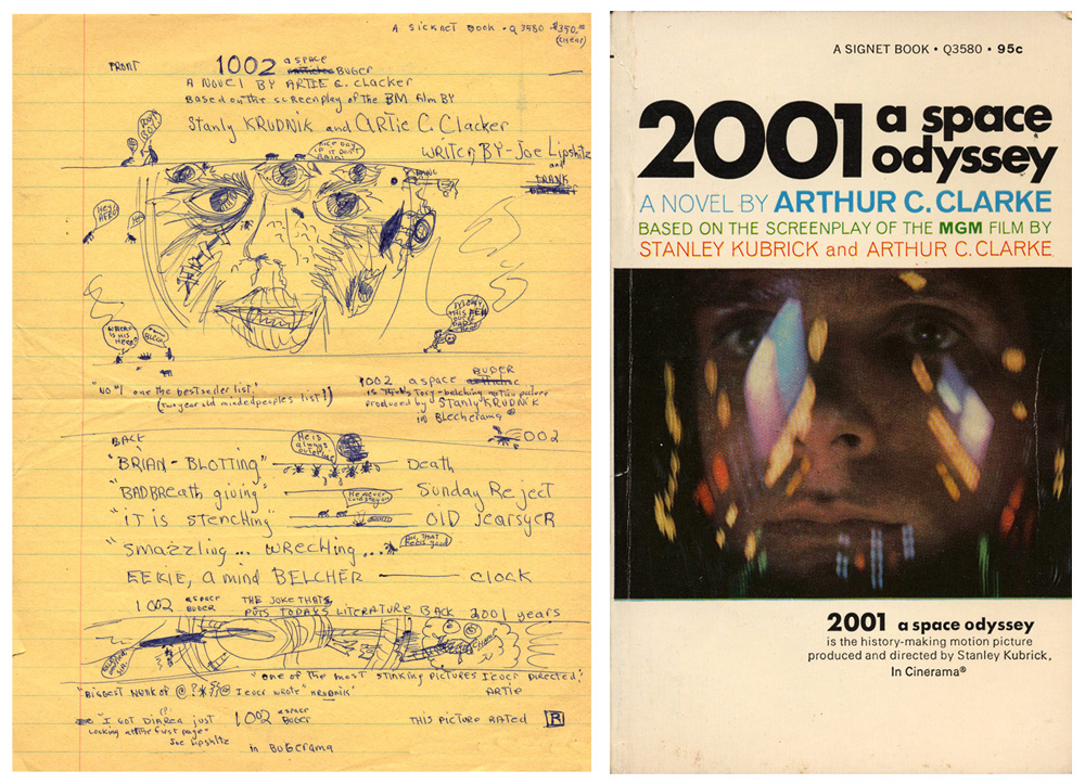
The best parts are the fake magazine blurbs. My favorite is, “Eerie, a mind belcher” ____ Clock
Clock. That would be Time magazine. Eighth grade humor. Gotta love it.
But, I digress.
The following series of stills show what is arguably the single greatest edit in movie history (Sorry, Sergei).
The set up: An alien intelligence has introduced the idea of the tool (and as a result, weapons) to the pre-human apes, thus staving off their extinction. In a moment of exaltation, the tool – a bone – is tossed into the sky. As we watch the white bone/tool rise and fall, end over end, through the air the scene abruptly cuts to the blackness of space and a similarly shaped white ship orbiting the moon.

We see the origin of the tool and its leap forward millions of years to the ultimate development of that tool, space travel. Visually, a white cylinder against a blue sky cuts to a white cylinder against black space. Conceptually and visually so beautifully concise.
That edit, that cut, forever after affected the way I looked at juxtaposed images. Whether watching other movies or reading comic books, I became more aware of the relationships of picture-to-picture movement. The more I began to make sequential art, the more conscious I became of my decisions about how images related to and affected each other. That cut became this little kernel in the back of my mind. It’s always there when I’m drawing a book, making me consider every pictorial relationship.
Did I really remember this as being connected to 2001? Yes, because I went to see the movie whenever and wherever I could. This was in the prehistoric days before VCR’s. If I wanted to see 2001, I had to find a theater that was showing it. In the first ten years after the film’s release I saw it twenty five times. Living in New York helped, since back then there were repertory houses everywhere.
The thirteen year old mind is an impressionable thing.

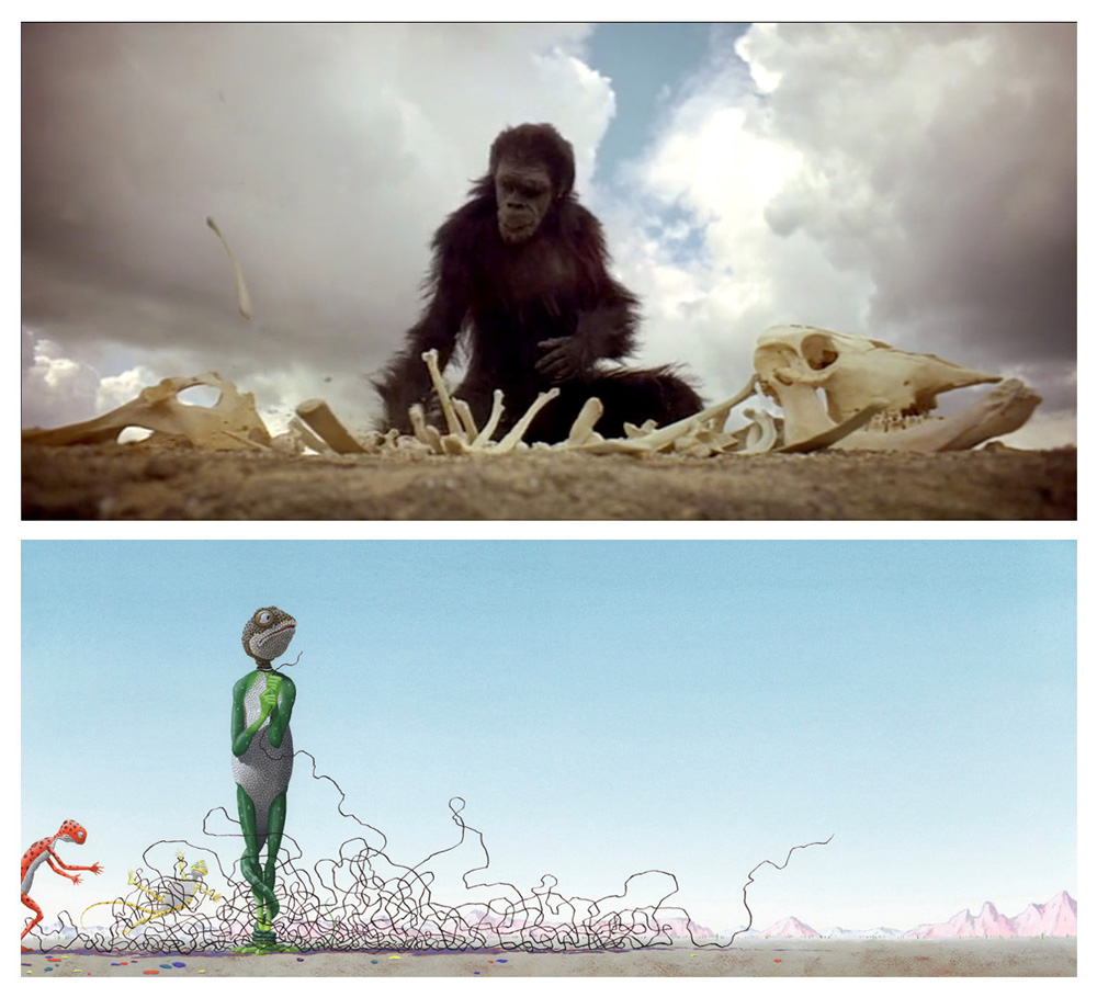
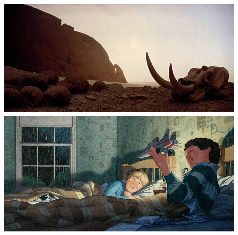
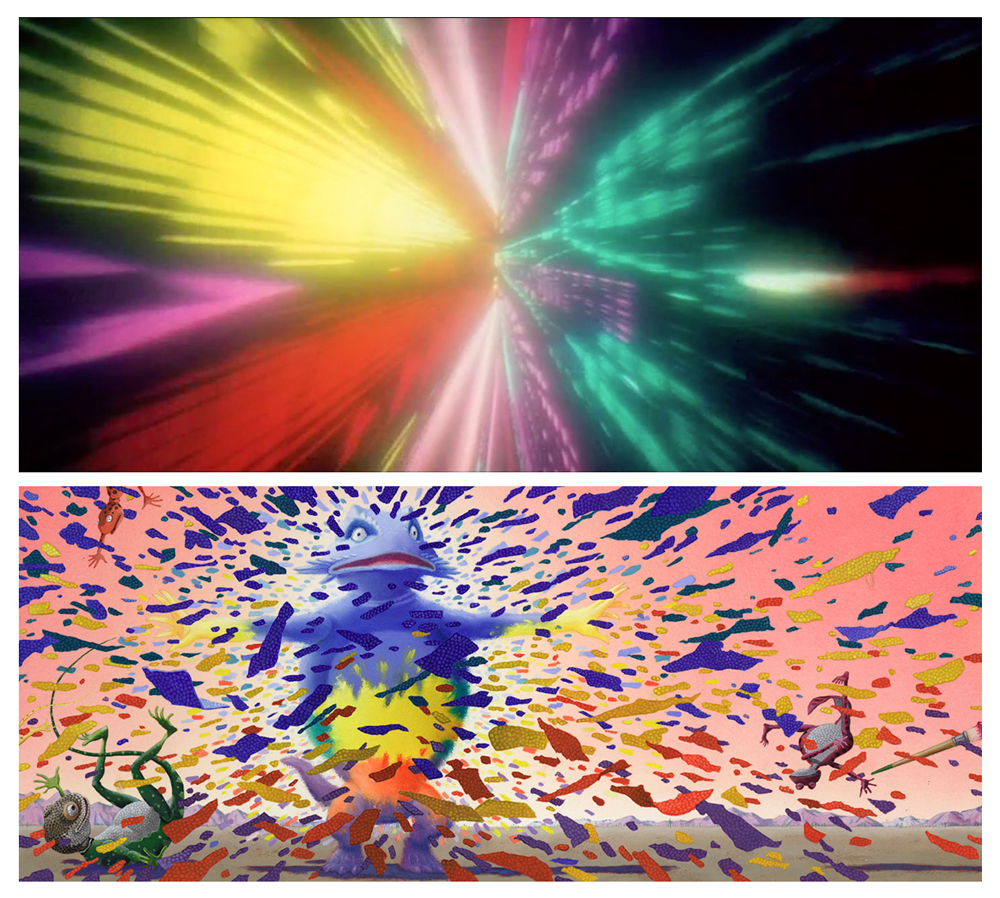
I’ve gone on this long, why not keep going? Remember that picture for RIF at the beginning of this post? These are the scenes from the movie that it alludes to:
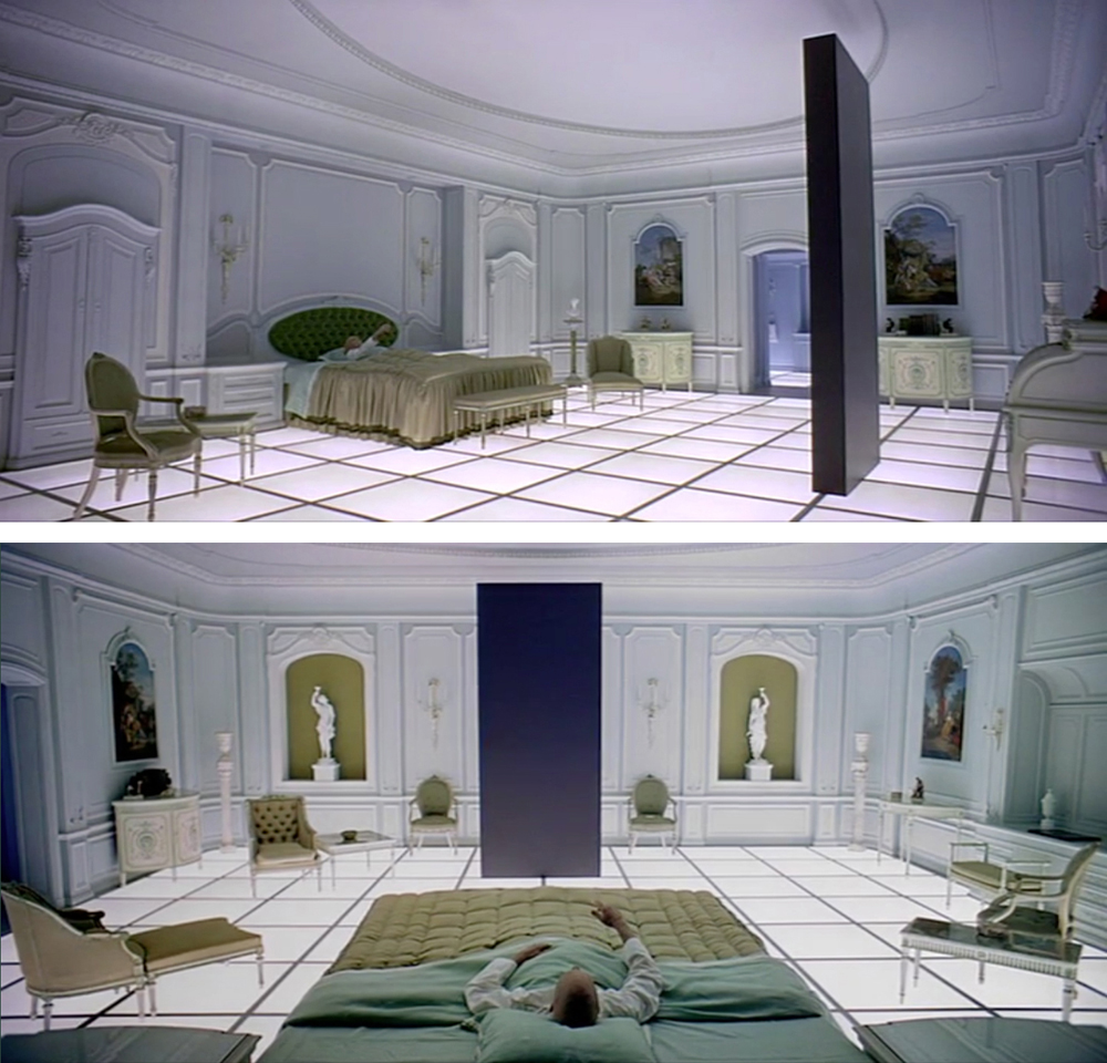
Look at the shape of those frames. 2001 was shot in Super Panavision 70 and projected at an aspect ratio of 2.21:1. Basically, that means the picture is very wide and thin.
I see the world in this aspect ratio. Really. Look at my books:
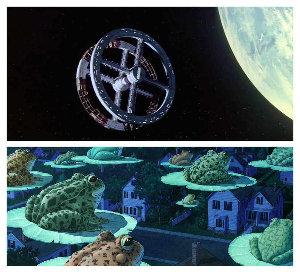
Open them up and a double page spread is 9 inches high and 22 inches wide.
Instant Cinerama.

I have been consciously aware of all the connections I mention above. But, sometimes this stuff works its way out from the unconscious.
It wasn’t until months after publication that I looked at the cover of Flotsam and had this revelation:
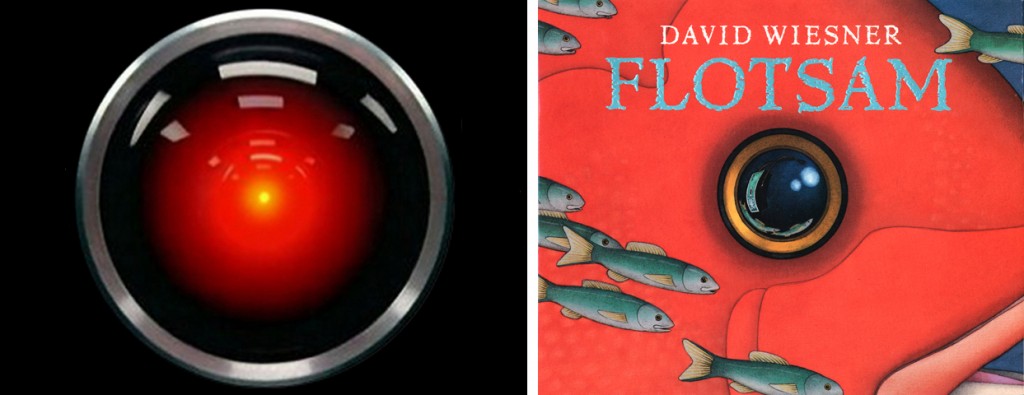
Dave, my mind is going. I can feel it.